

This post contains affiliate links. As an Amazon Associate I earn from qualifying purchases, at no extra cost to you. Thank you for supporting Diynify!
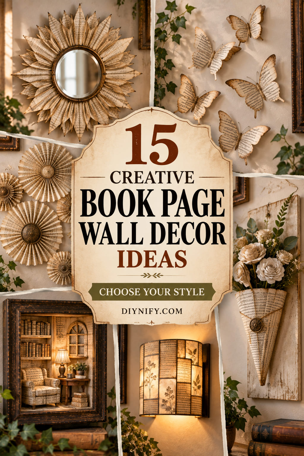
Old printed pages already bring pattern, warm neutral color, and a sense of age, which makes them especially useful for book page wall decor. The strongest projects do more than glue pages to a surface: they fold the paper into shadow, use text direction as pattern, build repeated shapes, or turn lightweight pages into hanging and framed structures.
Most of these ideas use unwanted or damaged book pages, scissors, a craft knife, a ruler, and paper-safe adhesive. A few need chipboard or cardboard backing, a shallow frame and spacers, twine or a dowel, a lightweight mirror, a quilling tool or skewer, vellum, or a cool battery-powered LED. If a book is collectible, sentimental, or still useful, keep it intact and use pages from a damaged copy instead.

1. Build a Cascading Botanical Branch Collage

Let the printed text act as texture instead of trying to hide it. Cut or tear leaves from different page areas so some carry dense paragraphs, some show wide margins, and a few include chapter headings or larger type. Arrange the leaves along one sweeping branch on a quiet backing, turning the text in slightly different directions so the foliage feels varied without adding extra color.
The composition works best when the branch has a clear direction and plenty of open space around it. Lay the entire arrangement out before gluing, then attach the smallest leaves last so they can bridge awkward gaps rather than create them. A narrow black or dark brown paper stem gives the pale pages enough structure to read from across the room while keeping the overall look soft and vintage.
2. Fold an Accordion Rosette Gallery Cluster
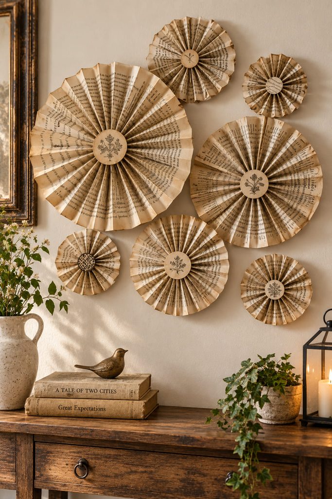
Want circular relief without introducing a busy palette? Book-page rosettes create shadow through pleats, so even similar cream and tan pages can look layered once they catch side light. Mix a few diameters rather than making every medallion identical; the cluster will feel collected instead of tiled.
- Cut long page strips and score even accordion folds so the pleats close cleanly.
- Join strip ends into a ring, press the center inward, and secure the back to a small cardstock or chipboard circle.
- Make several sizes, arrange them on the wall as a loose oval or corner cluster, and mount only after the spacing feels balanced from normal viewing distance.
Keep the largest rosette slightly off-center and let smaller pieces trail away from it. That asymmetry makes the group easier to fit above a console, beside a frame, or into an awkward wall corner.
3. Frame a Rolled-Page Sunburst Mirror
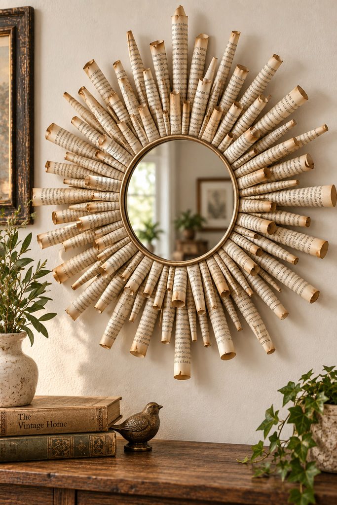
What usually fails first in a paper sunburst is not the decorative ray but the support behind it. A small lightweight mirror needs a rigid backing ring wide enough to carry both the mirror and the rolled-page rays; attaching individual tubes directly to the mirror edge leaves too little glue area and makes alignment harder.
Roll pages diagonally around a skewer or narrow dowel, then slide the tool out so each ray keeps a slim tapered tube. Flatten only the inner inch of each tube where it meets the backing. Stagger long and short rays around the ring, working opposite sides in pairs so the visual weight stays even as the circle fills. A second cardboard ring over the flattened ends can sandwich the rays in place and hide the rough attachment zone.
Backing Ring Check: Before hanging, hold the finished piece upright by its intended wall attachment for a short inspection. If the backing flexes, the mirror shifts, or several rays droop together, reinforce the rear structure rather than adding more glue to the decorative front.
This idea earns its drama from projection: the printed rays cast a fine halo of shadows around the mirror. Keep the mirror modest in size so the paper remains the main visual material rather than a fragile frame around a heavy object.
4. Weave a Framed Page-Strip Wall Panel
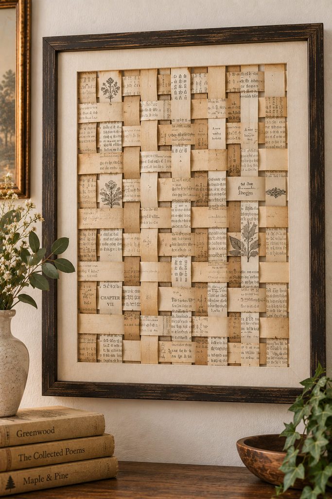
If you want the typography itself to become pattern, weaving gives every strip a structural job. Trim pages into consistent-width bands, then alternate them over and under perpendicular strips on a rigid backing or within a lightweight frame. Rotating some strips ninety degrees makes the printed lines cross like a quiet textile pattern instead of reading as intact paragraphs.
| Weave Check | What to Look For |
|---|---|
| Over-under path | Every new strip alternates correctly across the row |
| Edge alignment | Outer strips stay parallel instead of creeping inward |
| Tension | Strips lie flat without buckling or pulling the panel out of square |
| Attachment | Glue or tape is concentrated at hidden edges, not smeared across the woven face |
Keep the Weave Square: If the last few rows start narrowing, stop and realign the outer strips before adding more. A small drift becomes obvious once the panel is framed.
Leave a narrow border of backing visible around the weave. That margin separates the busy printed texture from the frame and makes the piece look deliberate rather than like a sheet of paper matting.
5. Send Folded Book-Page Butterflies Up the Wall
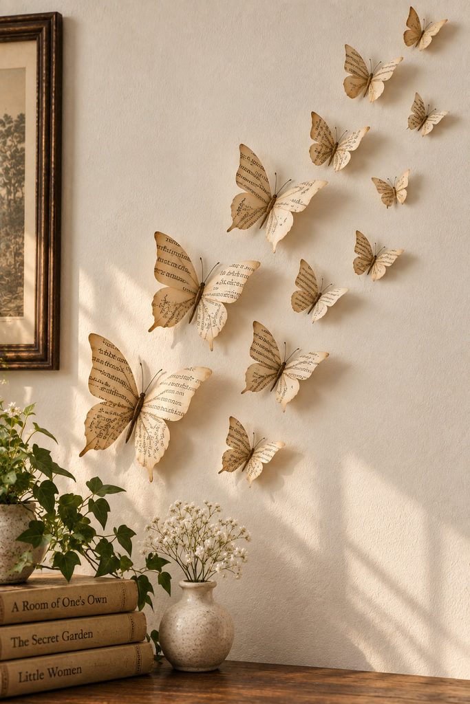
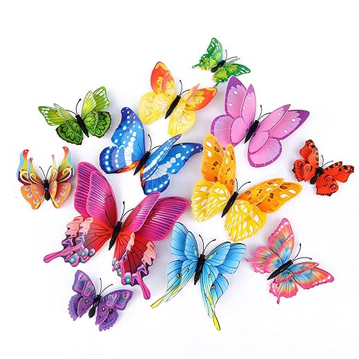
Cut fewer butterflies than you think you need, then use the empty wall as part of the composition. A simple center crease lifts both wings away from the surface, while a tiny attachment point at the body keeps the silhouette light. Vary size more than shape and arrange the pieces in a loose upward curve, concentrating them near the starting point and widening the gaps as the flight rises. The fading density creates movement without requiring dozens of identical cutouts.
6. Roll a Book-Page Cone Wreath
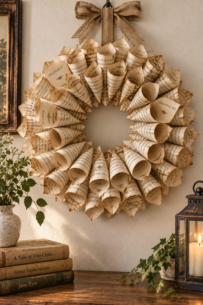
Repeating tapered cones turns flat pages into a deep ring of shadows, but the center opening and cone angle need to stay consistent. Roll each page into a cone, secure the overlap, and attach the wide ends around a cardboard wreath base so the pointed tips aim toward the center. A second outer layer can overlap the first to hide the backing and make the wreath feel fuller without increasing its diameter too much.
| If You See This | Adjust This |
|---|---|
| A lopsided center opening | Recheck the cone angle before gluing the next section |
| Large gaps between cones | Increase overlap slightly rather than adding random filler pieces |
| A heavy, drooping lower edge | Use fewer layers or a stiffer backing ring |
| Cones springing open | Increase the glued overlap and let each seam set before mounting |
A thin ribbon or concealed loop should attach to the rigid backing, not to one of the paper cones. That keeps the load off the decorative layer and lets the circular silhouette stay crisp.
7. Make a Typography Patchwork Grid
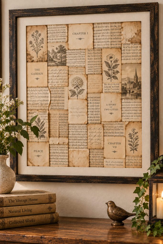
For a calmer vintage wall, use whole page fragments as blocks rather than cutting them into motifs. The effect can lean orderly or deliberately imperfect, and that choice changes the mood more than adding another embellishment.
| Layout Route | Best Effect | Construction Note |
|---|---|---|
| Strict grid | Quiet, architectural, library-like | Keep margins consistent and square every piece to the backing |
| Staggered patchwork | Softer, collected, more casual | Offset seams and mix torn with trimmed edges, but repeat a few alignments so it does not look random |
Choose one route before gluing. A wide mat or unprinted border is especially helpful here because the artwork is visually dense; the blank perimeter gives the eye somewhere to rest.
8. Hang Folded Page Leaves from a Slim Dowel
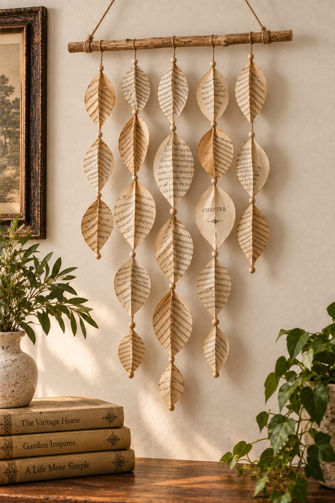
On a narrow wall, a vertical hanging can fit more naturally than a wide framed piece. Fold elongated leaf shapes along a center vein, pair them back-to-back around short lengths of thread, and suspend the strands from a slim wooden dowel or straight branch. Vary strand length so the lower edge forms a gentle taper rather than a hard rectangle.
The dowel carries the load, while the pages only need to support their own weight. Suspend it from two level loops or another wall-safe support suited to the surface so the bar cannot rotate under uneven strand weight. Leave enough clearance from the wall for the folded leaves to keep their shape and move slightly instead of being pressed flat. For storage, lift the entire hanging down by the dowel rather than gathering the paper strands into a bundle.
9. Layer a Book-Page Reading Nook Shadow Box
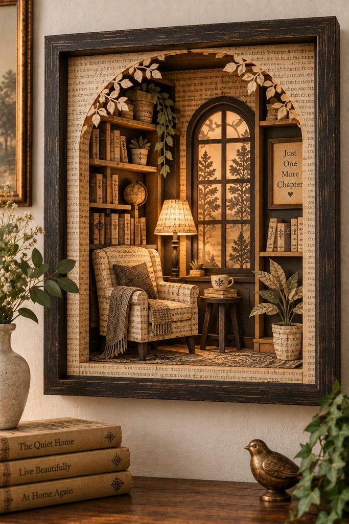
Build the depth before the detail. A shallow reading-nook scene works when each layer has a clear distance from the next: perhaps an arched foreground, a chair or lamp silhouette in the middle, and a window or shelf shape at the back. Printed book pages can cover selected layers, while plain dark cardstock separates silhouettes that would otherwise merge into one field of text.
Start by making a layer map on scrap paper and decide where the open areas need to line up. Cut the deepest background first, then work forward, checking each opening before adding foam spacers or folded paper tabs. Keep spacer thickness consistent within one depth level; irregular gaps can twist the scene and make a frame sit crooked. Small printed details are most effective on broad surfaces where the typography can still be seen.
Frame Depth Test: Set the assembled stack inside the frame before final sealing. Nothing should touch the glazing, buckle against the back, or block the open view through the front arch. If the stack is too deep, reduce spacer thickness or simplify one layer instead of compressing the paper.
This is one of the better projects for pages with mixed aging because the changing tones read like atmospheric depth. The frame does the protective work, so the paper layers can stay delicate without becoming exposed wall pieces.
10. Coil a Quilled Book-Page Monogram
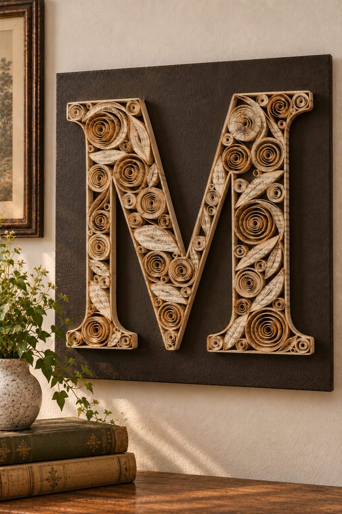
Coiling narrow strips changes lines of print into tiny spirals and teardrops that can fill a letterform without looking like a flat collage. Roll strips around a quilling tool or thin skewer, let the coils relax, then pinch selected pieces into leaf or eye shapes before gluing them to a sturdy backing inside a lightly drawn initial. Keep some open space inside the letter instead of filling every gap; the negative space makes the monogram readable from farther away.
11. Make a Wall Pocket for Book-Page Flowers
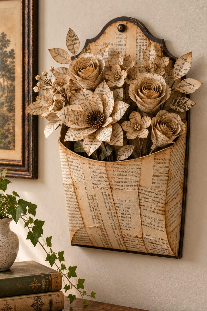
Because the pocket must carry something, build its structure before covering it with printed paper. A shallow chipboard or heavy-cardstock base can form the back, bottom fold, and side gussets; book pages then become the visible skin rather than the load-bearing material. The top opening needs enough width for a small bundle of lightweight paper stems without forcing the sides outward.
Add the flowers only after the empty pocket hangs flat. Rolled or folded book-page blooms can be fixed to paper stems, then loaded from the top so individual pieces can be rearranged. Keep the center of mass close to the wall: long, top-heavy stems will pull the pocket forward even if the adhesive joints are strong.
Load It Before Hanging: Test the finished pocket with the actual paper stems while holding it upright. If the bottom bows, reinforce the base; if the front tips outward, shorten the stems or deepen the rear support before choosing a wall attachment.
Use two attachment points on the rigid back so the pocket cannot rotate as contents shift. The functional difference is useful in an entryway or reading corner where a flat collage would feel too passive. The pocket remains decorative, but it also gives you a place to rotate seasonal paper stems, tags, or lightweight notes.
12. Stretch a Stitched Page Pennant Banner Across a Wide Wall
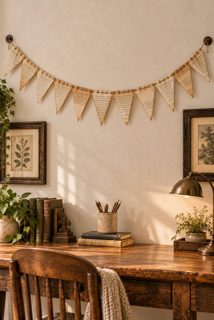
When the room needs one long horizontal line, a page pennant banner can bridge the space without the visual weight of a large frame. Cut flags from pages with varied text density and fold a narrow top tab over cord, or stitch the flags onto a paper tape strip before tying that strip to the cord. The attachment should carry each flag along its full top edge rather than at one fragile corner.
| Banner Check | Pass Condition |
|---|---|
| Span | The cord reaches both mounting points without excessive sag |
| Flag spacing | Gaps repeat consistently enough to read as rhythm |
| Edge clearance | Pennants do not brush lamps, doors, or moving objects |
| Paper curl | Flags hang freely instead of twisting around the cord |
A slight curve in the cord usually looks more natural than pulling it perfectly straight. If the wall is very wide, enlarge the flags before simply adding dozens more; scale is easier to read from across a room than tiny repeated detail.
13. Shape an Oversized Book-Page Feather Relief
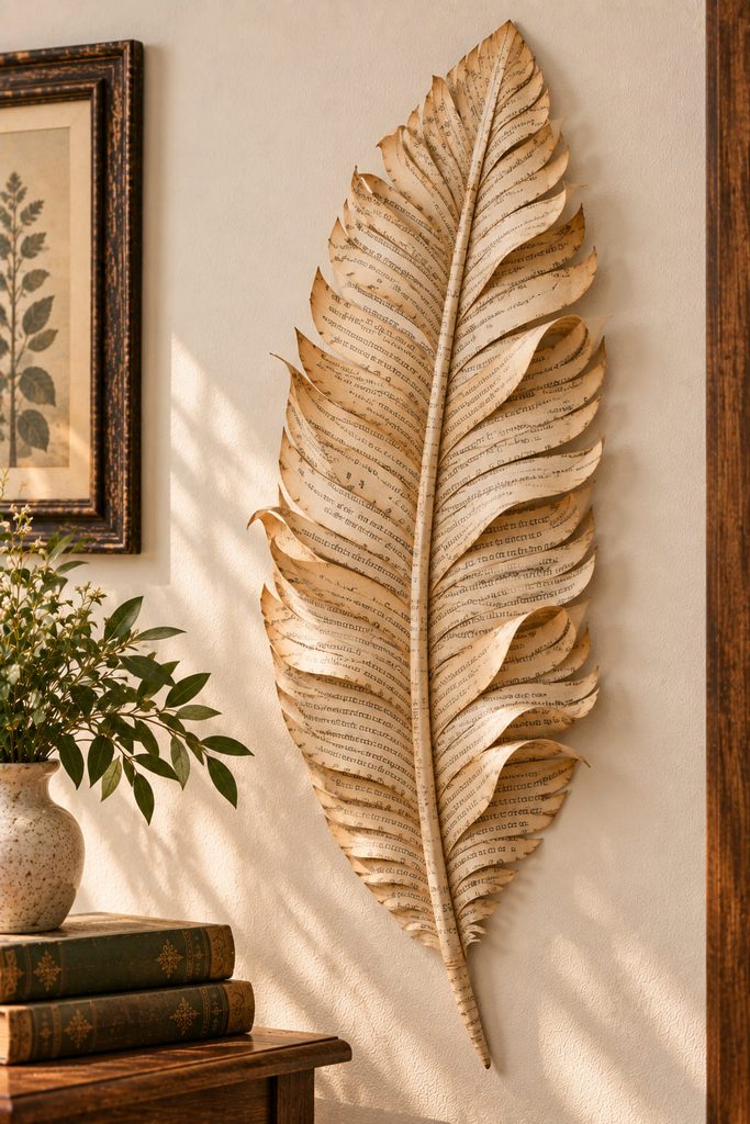
More than the fringe, the center fold gives an oversized paper feather its convincing structure. Cut a long tapered feather silhouette from layered pages or lightweight cardstock covered with page fragments, score a shallow center spine, then snip narrow angled cuts toward that spine. Curl alternating fringe sections forward and back so side light catches multiple planes instead of one fuzzy edge.
Mount the feather along the spine rather than flattening every barb to the wall. That single raised ridge keeps the piece sculptural while the cut edges stay light. One large feather works well as a vertical accent beside a shelf or mirror; several smaller copies would lose the impact and start to resemble generic leaf decor.
14. Build a Fringed Book-Page Dowel Hanging
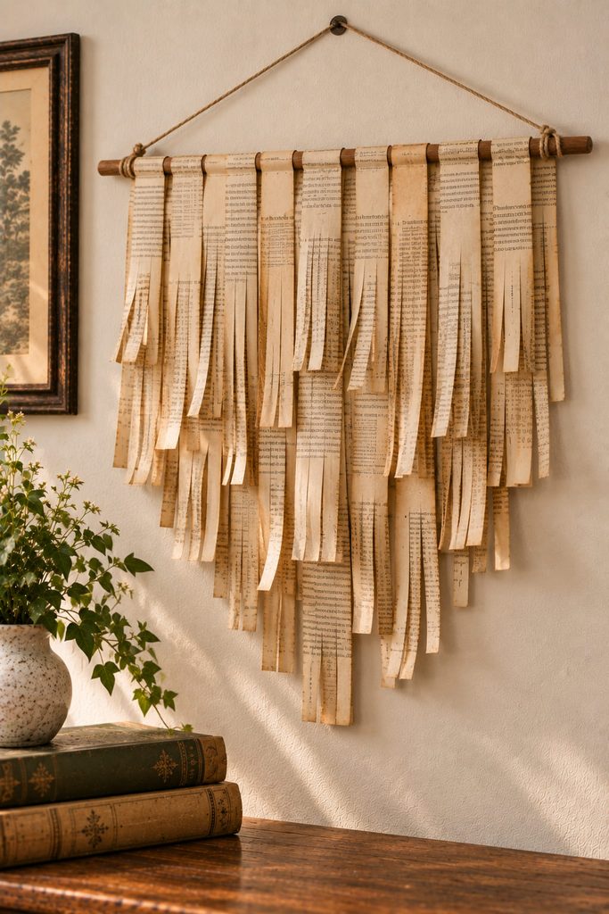
Instead of hanging one solid sheet, turn narrow page strips into a soft vertical fringe. Fold each strip over a dowel, secure the fold at the back, and cut long slits upward from the bottom while leaving an uncut band near the top. Mixing strip lengths creates a stepped lower edge, and slightly curling a few fringe ends keeps the piece from reading like a flat curtain.
| Problem | Likely Cause | Practical Fix |
|---|---|---|
| Fringe bunches in the center | Too many strips packed onto a short dowel | Remove strips or use a wider support |
| Long cuts tear upward | The uncut top band is too narrow | Stop the slits farther from the fold |
| The lower edge looks heavy | All strips end at the same depth | Trim selected strips into a gradual taper |
| Strands tangle easily | Fringe is too fine for the paper | Use fewer, wider cuts |
Support the dowel from two balanced wall points rather than one center loop, which can let the fringe tilt as its weight shifts. This hanging is best where it can remain mostly still. A doorway or breezy window encourages tangling; a quiet wall lets the cut texture cast soft shadows without constant movement.
15. Make a Backlit Book-Page Wall Sconce
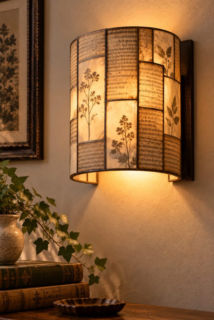
Under backlighting, printed pages become warmer and more translucent, so a small wall sconce can create a vintage glow without staining or painting the paper. The safest construction is a shallow open-back shade built around a rigid lightweight frame, with book pages forming the visible outer layer and small cut or vellum-covered openings creating a continuous path for light.
Keep the light source separate from the decorative paper. A cool battery-powered LED puck or short LED module can sit on the wall or backing plate behind the shade, with enough open space around it for access and removal. The shade should attach independently so you can take it off without tearing the paper, and the bottom or side should remain open enough to reach the battery compartment.
Use a Cool LED Only: Do not place a candle, incandescent bulb, or other hot light source behind paper. If the LED housing becomes noticeably warm in normal use, choose a different light source rather than reducing clearance.
Before mounting, view the shade in a dim room and look for blocked patches, visible hardware, and uneven hotspots. Add diffusion with vellum behind selected openings rather than layering extra book pages over the entire light path. The result should read as a shallow illuminated wall object, not as paper wrapped tightly around a lamp.
How to Make Book Page Wall Decor Look Intentional
The easiest way to keep printed-page projects from looking visually noisy is to control one variable at a time. If the text is busy, simplify the silhouette. If the construction is highly dimensional, keep the palette narrow. If the project uses many repeated pieces, introduce variety through scale or spacing rather than through unrelated embellishments.
Brittle pages also need a different approach from newer paper. Use them for collage, light layering, loose coils, or supported shapes instead of forcing tight folds that crack along the crease. For wall pieces that project outward, let chipboard, cardstock, a frame, dowel, or backing ring carry the load while the book pages provide the visible surface.
Choose the Texture Before the Motif
Start with the kind of wall presence you want: flat typography, shallow shadow, soft hanging movement, a functional pocket, or a small pool of light. That choice quickly narrows the techniques and helps the vintage paper feel intentional rather than merely recycled. If you want to compare book pages with other materials and wall formats, continue with Paper Wall Decor Ideas & SVG Designs.