This post contains affiliate links. As an Amazon Associate I earn from qualifying purchases, at no extra cost to you. Thank you for supporting Diynify!
Christmas scrapbook layouts feel much more intentional when the page has a clear visual job. One spread might give a favorite family photo almost the entire stage, while another can guide the eye through several candid shots, use patterned paper as structure, or leave generous blank space around one small moment. The strongest layouts are not simply decorated pages—they control where the eye lands first and how it moves next.
Most of these ideas use scrapbook paper or cardstock, printed photos, a paper trimmer or scissors, adhesive, a ruler, and a journaling pen. A few work best with foam tape, vellum, or extra matting paper. Choose the layout around the number and orientation of your photos first, then add Christmas color and embellishment after the composition is doing its job.

1. Full-Width Hero Photo With a Journaling Rail
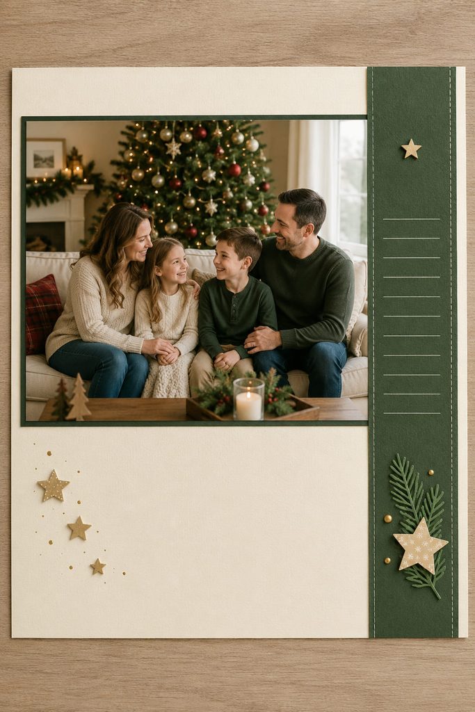
When one Christmas photo carries most of the story, let it stretch nearly the full width of the page instead of shrinking it to make room for decorations. A landscape family portrait, tree-lighting photo, or Christmas morning scene can sit across the upper two-thirds of the layout, with only a narrow cardstock mat showing around it. The large image becomes the immediate focal point, so smaller paper accents can stay restrained.
Use the remaining side or bottom edge as a slim journaling rail rather than a separate block floating elsewhere. A vertical rail works especially well beside a horizontal photo because it creates a clean change in direction; a bottom rail feels calmer and leaves room for a short title, date, and two or three lines of notes. Keep the rail narrower than the photo so it reads as supporting information, not a competing panel. This layout is strongest when the picture already has good detail and does not need several smaller images to explain the moment.

2. Stair-Step Three-Photo Layout
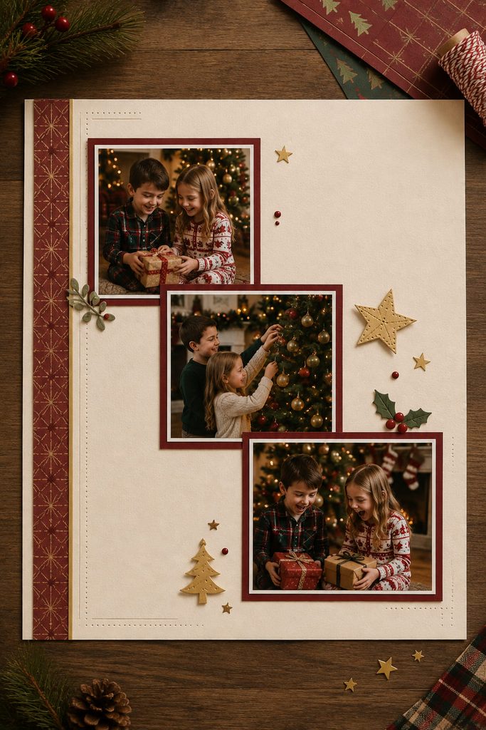
Run three photos down the page in a staggered stair-step when each image deserves attention but a rigid row feels too formal. The diagonal movement gives the eye an obvious route while leaving small pockets of background for a date, tiny paper stars, or short captions.
- Place the largest or strongest photo first, slightly above or below the page center.
- Offset the second photo diagonally so one edge loosely aligns with the first rather than overlapping it.
- Place the third farther along the same path, keeping the gaps visibly related.
- Add one narrow title or journaling block parallel to a photo edge instead of following the diagonal with more decoration.
Photo Rhythm Check: Step back and look at the empty gaps between the three frames. If one gap is noticeably tighter than the others, the sequence will feel accidental. Adjust spacing before adding embellishments, because extra stars or stickers rarely fix an uneven visual path.
3. Circular Photo Orbit Around a Quiet Center
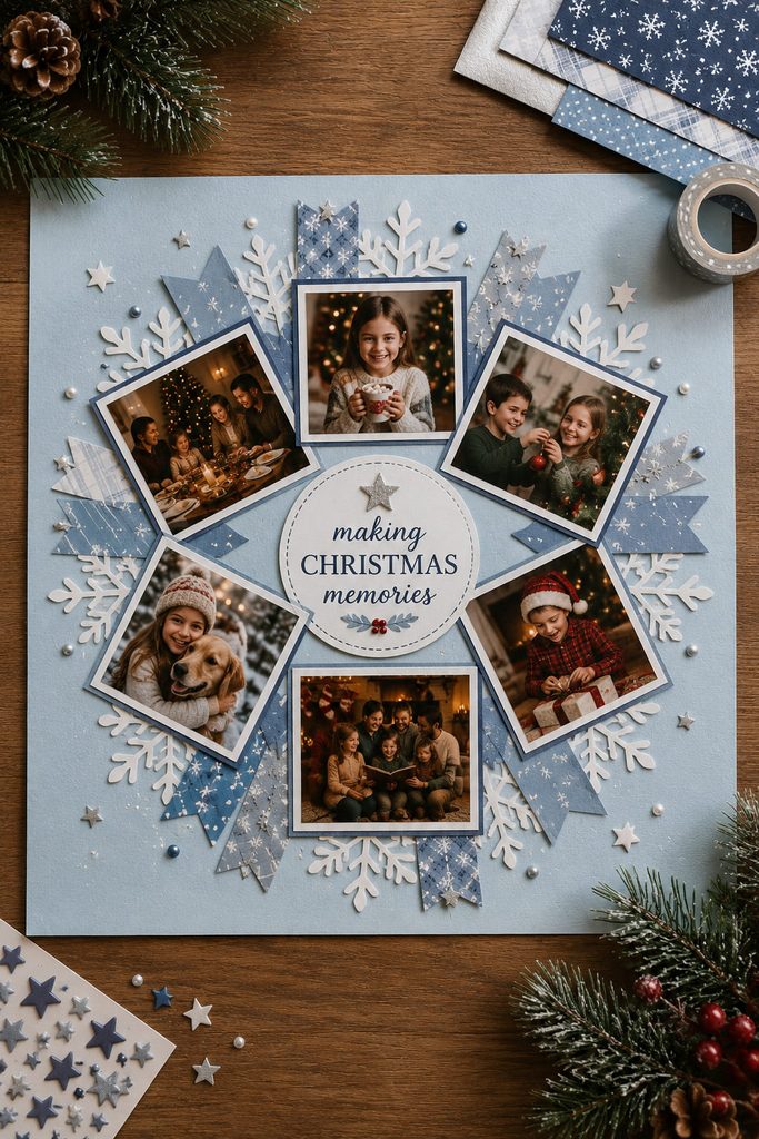
A ring of small photos can make several holiday snapshots feel connected without turning the page into a rectangular grid. Arrange four to six cropped images around an open center, rotating them only slightly so faces stay upright and easy to read. The middle can hold a short title, a handwritten quote, or simply remain empty; that calm center is what lets the surrounding photos read as one deliberate orbit instead of scattered pieces.
Keep the photos similar in visual weight even if their exact sizes differ. A large dark image on one side and several pale thumbnails on the other will pull the circle off balance, so redistribute by tone as well as shape. This composition works especially well for a collection of small moments from one gathering where no single photo needs to dominate.
4. Split-Page Layout With One Strong Color Block
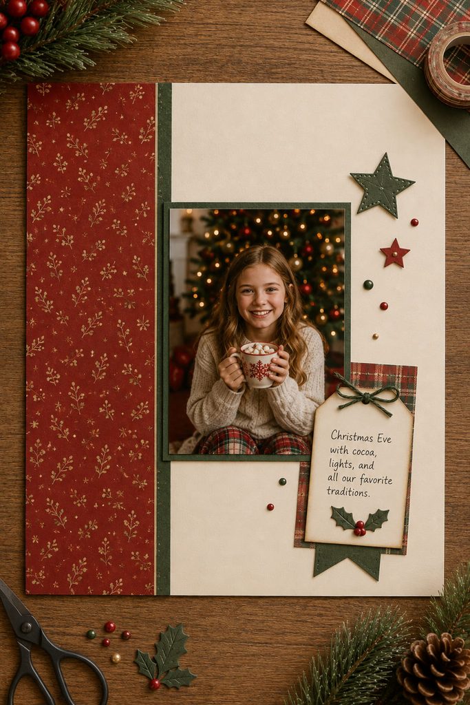
If you are deciding between a highly decorated page and a clean photo-first layout, a split-page composition gives you a useful middle route. Divide the background into two unequal fields—roughly one-third and two-thirds works better than a perfect half—and let the smaller field carry the strongest Christmas color. The larger field stays quieter and holds the main photo or photo pair.
There are two good ways to use the divide. A vertical split suits portrait photos and gives you a tall strip for a title, journaling, or a few repeated motifs. A horizontal split feels more like a shelf and works well with landscape photos or a row of smaller images. The choice should follow the photo orientation rather than the patterned paper you want to use.
Color-Block Balance: If the colored section contains a busy print, keep the photo side mostly solid and repeat that color only once in a mat or small accent. If the block is plain cardstock, it can carry more embellishment without overwhelming the image. The useful test is whether your eye still lands on the photo before it notices the paper.
5. Oversized Title Band With a Small Photo Cluster
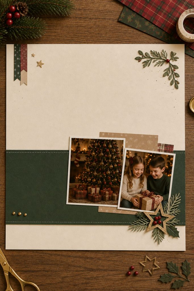
An oversized title band creates a strong graphic page when the words are part of the memory. A phrase such as “Christmas Eve,” “At Grandma’s,” or simply the year can run across the upper or lower third of the page on a solid strip of cardstock. Group two or three modest photos near one end of the band so the title and images behave like one anchored unit rather than separate decorations.

The band needs enough empty area around the letters to stay readable. If photos cover half the wording or embellishments fill every open gap, the headline loses the scale that made the layout interesting. Keep journaling compact and place it outside the title strip, preferably aligned with the photo cluster. This is a good choice for photos with mixed backgrounds because the strong band gives the page a shared visual structure without forcing every image into matching frames.
6. Loose Polaroid Cascade With Controlled Overlap
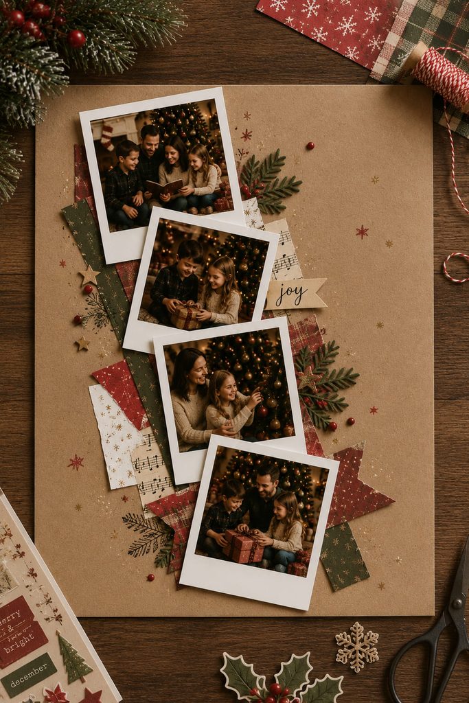
Polaroid-style prints get messy quickly when every frame is tilted, overlapped, and decorated independently. The fix is to treat the cascade as one shape. Start with the lowest frame, then let each new photo overlap only a small part of the previous border while the overall stack moves in a single direction. Keep faces and important details completely clear of the overlaps.
If the arrangement feels unstable, diagnose the problem before adding more pieces:

- The stack looks like it is sliding off the page: reduce the angle changes and align at least two outer edges.
- One photo disappears: move it forward in the overlap order or trim the neighboring border, not the image itself.
- The cluster feels too heavy: remove one frame and enlarge the space around the remaining group.
- The page looks random: repeat one consistent detail—such as the same white border width or one tiny date label—rather than repeating more embellishments.
The casual look comes from slight variation, not from abandoning alignment altogether.
7. Torn-Paper Snowbank Layout
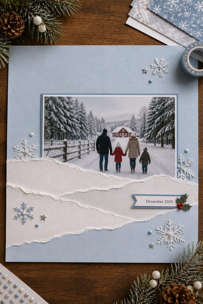
Torn white paper naturally creates a soft horizon that can anchor a winter photo without requiring precise die cuts. Layer two or three torn strips across the lower part of a muted background, offsetting the edges so each “snowbank” remains visible. Tuck the bottom edge of one landscape photo behind the upper layer and let the image rise above the paper line.

The torn fibers already provide texture, so extra snowflakes are optional. Heavy glitter, thick foam, and several patterned strips can erase the simple landscape effect. Use this layout when the photo includes outdoor winter light, a Christmas tree farm, a snowy walk, or another scene that benefits from a visible horizon rather than a dense decorative frame.
8. Diagonal Gift-Ribbon Photo Path
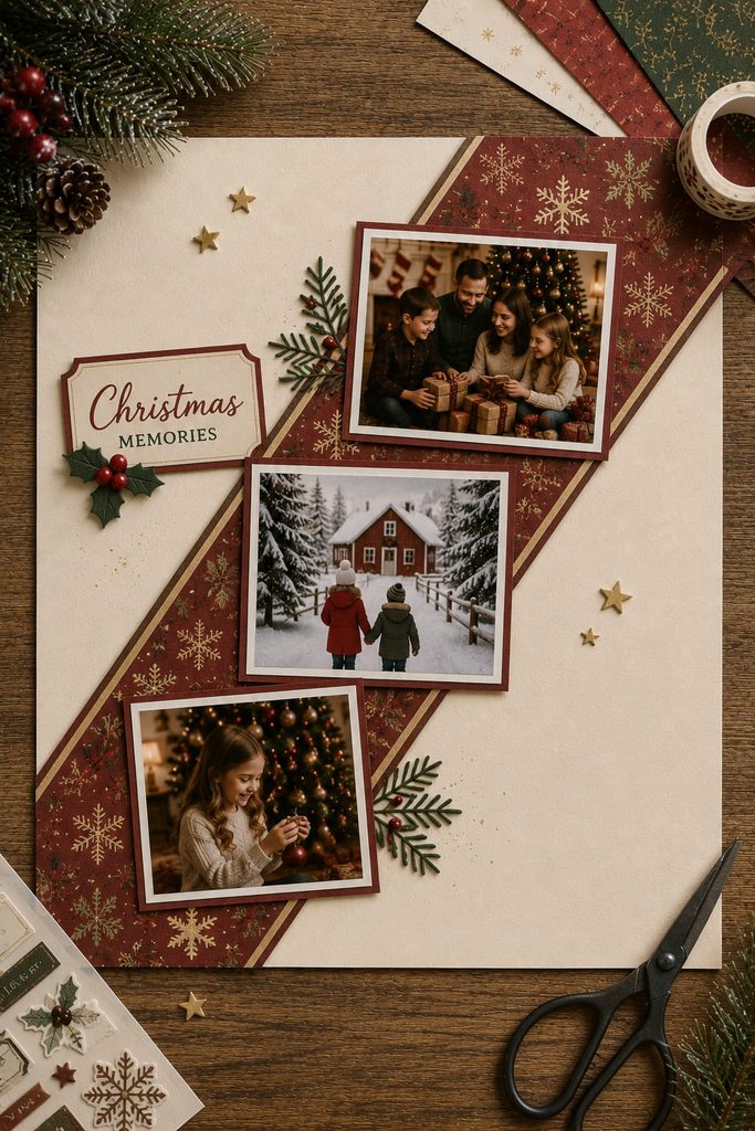
Run a wide paper strip diagonally across the page and it behaves like gift ribbon: it creates movement, connects separate photos, and gives the composition a reason to travel from one corner toward the other. The strip can be solid cardstock, a restrained Christmas pattern, or two narrower bands layered together. Photos sit partly on and partly off the diagonal so the line remains visible between them.

Build the path before you glue anything:
- Lay the diagonal strip across the empty background and decide which corner should feel visually heavier.
- Dry-fit the largest photo near that heavier end and place one or two smaller images farther along the strip.
- Keep photo edges mostly square to the page; tilting everything to match the ribbon usually makes the layout harder to read.
- Add a small title where the strip enters an open area rather than covering a face or detailed background.
- Trim the ribbon flush with the page only after the full composition is balanced.
Ribbon Path Test: Trace the diagonal with your eye from edge to edge. You should encounter the photos in a clear order without the strip disappearing under one oversized image. If the path breaks, move the photo slightly rather than adding another decorative band.
This layout can handle busier patterned paper than many photo-first designs because the diagonal supplies a strong underlying structure. The trade-off is that it needs breathing room at the opposite corners; filling those corners with extra clusters will cancel the sense of movement.
9. Bottom-Heavy Mantel Shelf Composition
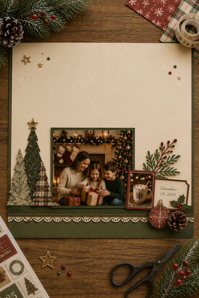
Instead of centering every element, build the lower third of the page like a mantel shelf. A narrow horizontal paper strip becomes the visual baseline, with one main photo resting just above it and two or three smaller accents distributed along the “shelf.” The upper portion stays noticeably lighter, which gives the page a cozy display-like feeling without drawing a literal fireplace.
Use repeated height changes to keep the baseline from becoming flat. A taller photo can sit near one side, a short journaling card near the other, and small paper trees or ornaments can bridge the difference. Keep the elements visually connected to the shelf line; floating pieces high above it will weaken the concept.
Check the page from arm’s length before gluing small decorations. The composition should still read as a grounded lower cluster with an open top. If the eye keeps drifting upward to a large title or dark embellishment, either reduce that element or bring it down into the main grouping.
10. Corner Cluster With Deliberate Negative Space
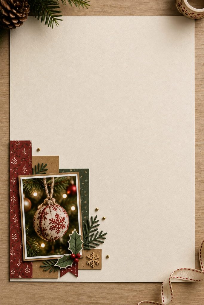
Leave a large part of the page empty on purpose and concentrate one photo, a short title, and a few layered paper pieces in a single corner. The unused area gives a small Christmas moment more visual importance than it would have inside a crowded multi-photo spread. This works particularly well with one candid snapshot, a detail photo of an ornament, or a quiet portrait.
Before committing, check the cluster against four questions:
- Does one element clearly lead the group?
- Do the smaller pieces touch or visually relate to that focal element?
- Is the empty area truly open rather than filled with faint stickers and scattered dots?
- Does the cluster sit far enough from the page edge to feel intentional?
Negative-Space Check: Stop decorating while the blank area still feels slightly generous. Once the space begins to look “used up,” the layout has lost the contrast that makes the corner composition work.
11. Repeated Border Motif Framing One Portrait
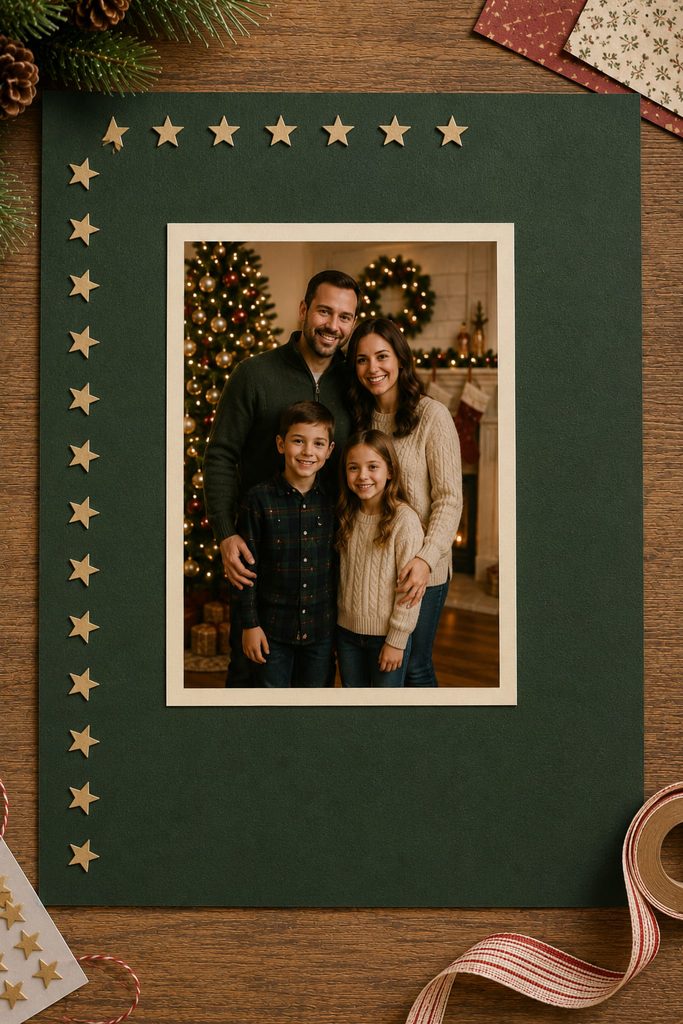
A repeated border motif can frame one portrait without building a thick mat around it. Choose a simple shape—small stars, holly leaves, scalloped tabs, or narrow paper rectangles—and repeat it along only two or three outer edges of the page. The portrait sits inside that implied frame with enough margin that the border reads as a perimeter, not a halo of decorations. Consistency matters more than quantity: keep the motif at one basic scale and vary spacing only slightly. If every border piece is different, the eye starts inspecting the embellishments instead of the face. This approach suits a clean posed portrait where a full patterned background would compete with clothing, lights, or tree details already visible in the image.
12. Horizontal Filmstrip Layout for Candid Photos
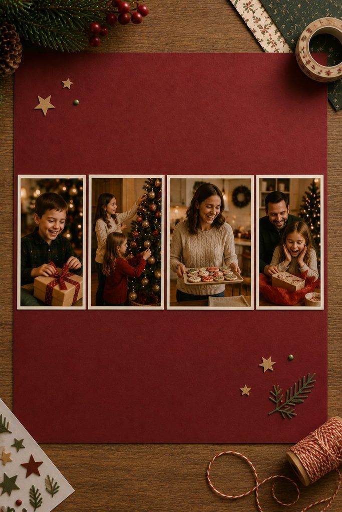
Have several candid photos from the same part of the celebration? A horizontal filmstrip can give them equal narrative weight without turning the page into a formal calendar or timeline. Place three to five photos in one long band across the page and keep their bottom edges aligned. Short captions can sit directly below each frame so the strip reads left to right.
There are two useful routes. Equal-size frames create a calm, documentary look and suit photos taken from the same distance. Varied widths work better when one landscape image needs more room than a couple of close-ups; keep the band height consistent so the strip still feels unified. Avoid using decorative “film perforations” unless they actually support the style—simple mats often look cleaner and keep more attention on the expressions.
The format is especially good for laughter, gift opening, baking, or table scenes where the charm comes from several related reactions rather than one perfect hero shot.
13. Panoramic Two-Page Spread Across the Gutter
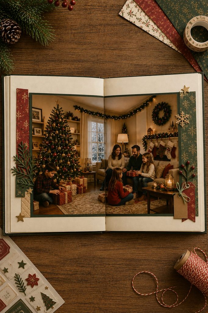
Once a photo spans both pages, the album gutter becomes part of the composition rather than an invisible seam. A wide tree-room scene, snowy landscape, or long dinner table can make an impressive two-page spread, but only if the fold does not cut through the subject that matters most. Place faces, lettering, and small details away from the center before you decide how large to print.
Use this order:
- Mark the approximate gutter and any page area that disappears into the binding.
- Position the panoramic photo so low-detail background crosses that zone.
- Crop the outer edges only after the safe center is established.
- Add journaling and embellishments to the outer thirds rather than piling them beside the seam.
- Close the album and reopen it to check what disappears when the pages are not perfectly flat.
Gutter Check: If a face, hand, ornament, or key architectural line appears broken when the spread is partially closed, shift the image or reduce its scale. A panorama should still make sense in a real album, not only when two loose sheets are photographed flat.
A full-bleed panorama gives the strongest immersive effect, while a narrow mat around the image makes the spread easier to align and leaves room for captions. The mat is usually the safer route for post-bound or ring-bound albums where the center gap is more visible. The visual payoff comes from width, so resist filling the remaining edges with several unrelated photos.
14. Asymmetrical Mat Stack With an Off-Center Photo
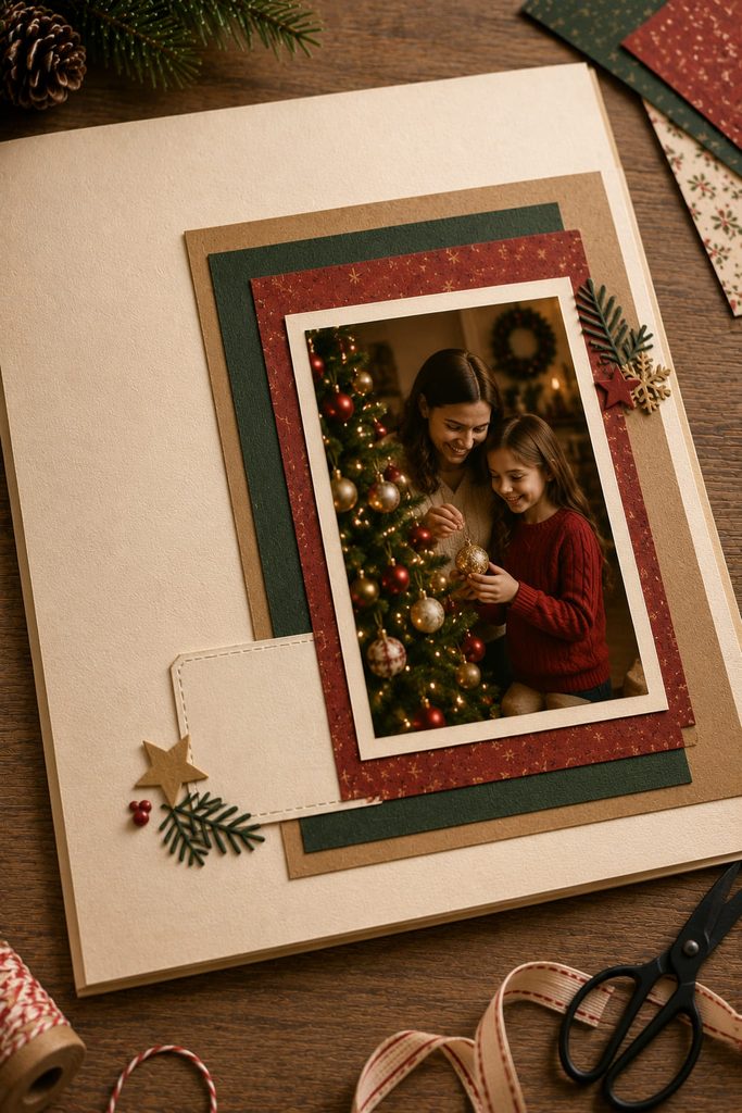
A busy holiday photo often becomes easier to read when the matting creates structure around it rather than adding more embellishments. Start with one main photo placed slightly off center, then build two or three paper mats that extend farther on different sides. One layer might show mostly at the left edge, another at the bottom, and a third as a narrow strip at the top. The uneven reveals create depth while keeping the photograph dominant.
Layer order matters because each mat changes both color balance and thickness. Dry-stack the papers first, choose the side that needs the strongest visual anchor, and trim the remaining edges only after the offset looks intentional. A small journaling card can tuck into the widest exposed mat area, but it should not turn every layer into a separate content zone.
Layer Thickness Check: If the stack begins to feel like a raised plaque rather than a scrapbook page, remove one layer or switch the deepest mat to thinner patterned paper. Foam tape is useful for one controlled lift, but several foam-mounted mats add bulk quickly and can press into the facing page.
This layout works best when you want dimension without a complicated interactive element. The paper itself creates the hierarchy: the photo stays readable, the offset layers bring in Christmas color, and the asymmetry gives the finished page enough movement to feel designed rather than simply centered.
How to Choose Between Christmas Scrapbook Layouts
Start with the photographs before choosing the Christmas paper. One strong image usually benefits from a hero-photo, border, corner-cluster, or layered-mat layout. Three related images can follow a stair-step path, while a larger candid set is easier to scan in a filmstrip or circular orbit. A panoramic scene deserves width; a visually busy photo often needs quieter surrounding paper.
| Photo Situation | Layout Direction |
|---|---|
| One strong landscape photo | Full-width hero or torn-paper snowbank |
| One clean portrait | Repeated border or asymmetrical mat stack |
| Three related photos | Stair-step or diagonal ribbon path |
| Four to six equal snapshots | Circular orbit or filmstrip |
| Busy photos with mixed colors | Split-page color block or oversized title band |
| One dramatic wide scene | Two-page panorama |
| One small, quiet detail photo | Corner cluster with negative space |
The useful sequence is simple: decide what the photos need, choose the page architecture, then add the Christmas motif. That order keeps decorative paper from forcing the layout into a shape that does not suit the images.
Build the Composition Before the Decoration
The easiest layout to recreate is not necessarily the one with the fewest pieces; it is the one whose structure matches your photos. Start with the hero image or the reading path, test the spacing with loose paper, and only then commit to adhesive. Christmas colors, stars, holly, snowflakes, and patterned paper work better when they reinforce an already clear hierarchy.
If you want a companion collection organized around the type of holiday memory you are preserving rather than page composition, see 14 Christmas Scrapbook Ideas for Meaningful Holiday Memories.